Pink Flowers, Awkward Diamonds, and Kitschy Charms
2023/6/28 01:58
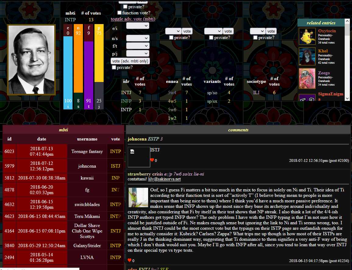
Okay, okay—I have a crazy little thing to show all of you. I don’t know how many of you out there reading this right now were around during this era of my website, but check this out:

It’s the old databank! It still exists and runs technically speaking, but it sure didn’t look anything like this last we saw of it. This is how it looked when I first made it in 2018, maybe about four~five months after its inception? Wild.
But what really catches my eye here is how it looks absolutely unlike anything I’ve ever seen a website look like. It really looks crazy. It’s just about unfathomable to me that this is something I made and shared around with people. How did people ever use it? I have no clue. You can see all the little functions crammed together right there, and yet… just what’s going on here?
But, hmm. The more I look at it, the more familiar it becomes. Somehow, as my eyes dart around all the little features, it starts to make sense to me. This is my work. It’s definitely mine. And you know? None of this is dead. At its heart, this website is still just like that. All those weird aesthetic choices, from the Times New Roman to the floating dropdowns to the colorful type names, still survive in today’s evolved Sakinorva.
I think my aesthetic choices with Sakinorva have always been very purposeful. It used to be harder for other people to recognize this in the past, though, since the website both looked very old and functioned like it was very old, but everything here was definitely by design. Of course, I wasn’t using flex containers or div tags like I’m doing today, but I was rather good at making that crazy table tag driven layout look as good as I could make it.
But that’s the key, right? Today’s Sakinorva isn’t actually old-fashioned, and it’s not nearly as messy as it used to be. I’m not using the font tag, or the bgcolor attribute, or even inline styling anymore. Back then, the website was littered with obsolete features that I stubbornly stood by. My philosophy was to limit myself and to expand with what I had, but I did certainly make a huge mess of things that I ought to have paid more attention to.
I still push myself a lot as I try to expand the site into new functional and aesthetic territory, but you will notice that a lot of things remain the same. White backgrounds? I still hate them. The tiling patterns? The squiggles, stars, hearts, and loops never left. The vibrant colorbombing? Just look anywhere. A clock across the top of the screen? It’s finally back!
Maybe I don’t have a new background show up on every page, and maybe I don’t have viewport-aligned elements on the page, but I think I’ve finally made good friends with the modern web… while still remaining very stubborn about my roots. As I learned more about web design and programming through my experience with this website, I think it only made sense that I’d end up in a place like this, where cute, pretty, and bold ended up making amends with functional, efficient, and uniform. It’s much more agreeable than what I’ve shown you up there, isn’t it, dear reader?
It really does kind of make me laugh, though. I can’t believe nobody ever pointed out to me just how crazy that webpage up there is. I’d gotten comments about it looking “old” in a not so nice way before, but I never had someone jolt me and scream something like “Exactly how am I supposed to use this thing?? It looks like a ten-year-old from 1998 made it! Do you understand just how weird and unprofessional this looks?”
I wonder how nostalgia for the real “new web” will look like in the coming years. We’re going through a big late 90s-early 2000s revival, so Sakinorva is certainly back in vogue, but there will come a day where people will look at the web right now and feel the same way about it. But I probably shouldn’t discount how distinctly different the various flavors of nostalgia are. There could very well come a day where people will long for the drab, monochromatic, spaced-out web design we’re seeing take over everywhere today.
But until then, let’s cherish this version of Sakinorva.