Like How Birds Chirp in the Morning
2023/6/28 04:21
Take a look at the background on the left and right hand sides. It’s an image I took from NetyaSun’s free website background image collection, a star-packed image of the night sky. Two stars on the left-hand side of the image shine really brightly, making the tiling effect really obvious. Even if I were to remove those, the three stars bunched up together at the bottom center portion of the image would probably end up creating a similar effect.
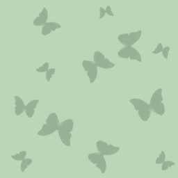
Compare that image to this one, the classic butterfly background you’ve probably seen if you’ve used Sakinorva in the past:

If you’re in a browser where you can easily switch out the body background URL, I suggest doing so here to see what it looks like. The image has a larger canvas size compared to something like the sky background, so its repeating effect is automatically more difficult to make out. But the way the butterflies are arranged makes the tiling background really appear as though it may not be tiling at all. Even when you do take hold of how it’s patterned, the tiling section looks more circular than anything else. Compare that to the night sky background, which seems to highlight an alternating parallelogram-like pattern.
In the past, I had hard, strict rules about what I thought made a good background. One of these rules, of course, was that the background had to look like it wasn’t tiling. I saw erasing this tiling effect as an art in itself, and I probably attributed this virtuous quality to it because it was one of those things that made your website look like it had more. If your background doesn’t tile, you probably put in a lot of work to fill it in with enough unique content or something. Of course, having an actual untiled background image that’s unique to each page you make is not just time consuming, but also inefficient and unnecessarily forces the user to download a big image.
Take a look at these old databank backgrounds: fans.jpg, checkers.jpg, poppotokaksin.png, nighttimeyukata.jpg
I wasn’t aware of why some backgrounds simply wouldn’t look very good even after I followed all of my rules just fine. My solution was usually to just darken or fade the background until it started to look good, while keeping it bright enough that the pattern’s personality still showed itself to the viewer. I fundamentally didn’t understand why that technique worked, but I could intuitively recognize that muting the background a little bit brought more attention to what showed up on the screen.
The thing with website backgrounds is that they don’t repeat without reason. This night sky background repeats the way it does because it’s not supposed to be the center of attention. It’s pretty when you see it out of the corner of your eye, plain when you focus your attention on it, but most importantly desirable if you want to focus on the content of the page—what’s showing brightly in the middle. The dark background, bright center panel, and dark text style is incredibly easy on the eyes. I think something I struggled with in the past was finding backgrounds that could set nicely against the text on the page, and I usually resorted to a pale yellow or pale blue color set against black text. It turns out that in terms of absolute grayscale, these were the colors that would offer me the greatest amount of contrast:

The classic BBS color schemes take advantage of these same colors, even using red text against yellow. So not only does a website need to look nice, but it also needs to be accessible. Places where I can be more creative about tiling backgrounds are places like you see here on the immediate left-hand side. This one happens to be a seamless background with a lot of personality, but it works because it’s sandwiched between a machinely drawn sky and a plain white background with black text; it leaves you engaged with the writing but still instills a quiet impression from the sidelines.
There’s an interesting kind of acceptance that comes with seeing a night sky like that plastered against the page. It’s a necessary choice. An ugly choice, but a good one. It’s the sort of choice we dare to make in order to move toward an ideal that we may not have an easy time imagining. I’ve mentioned before that we’re entering a revival of one of the gaudiest aesthetic eras in our time, but I really can’t help but appreciate how we’ve come to celebrate something so profoundly awful. Sometimes being stylish means making really strange choices.